Does the thought of combining stripes, florals, and geometric prints make you break into a cold sweat? You’re not alone. Many homeowners freeze when it comes to mixing patterns, worried they’ll create a chaotic mess rather than a designer-worthy space. But here’s the secret: mixing patterns like an interior designer isn’t magic—it’s method. With a few simple principles and some confidence, you can transform your home from safe and predictable to layered and professionally styled.
Why Mixing Patterns Matters in Interior Design
Pattern mixing isn’t just a design trend—it’s a fundamental technique that interior designers use to create depth, visual interest, and personality in a space. A room with only solid colors can feel flat and uninspired, while thoughtfully mixed patterns add layers that make a space feel complete and professionally designed.
The good news? You don’t need years of design school to master this skill. With a few foundational principles and some practice, you can start mixing patterns like an interior designer in your own home today.
The Core Principles of Pattern Mixing
Before we dive into specific techniques, let’s understand the three fundamental principles that guide successful pattern mixing in interior design.

Understanding Scale: The Foundation of Pattern Harmony
Scale refers to the size of patterns relative to each other. When mixing patterns like an interior designer, varying the scale is crucial for visual harmony. Think of it as creating a visual hierarchy that guides the eye through your space.
The Rule of Three Scales
Professional designers often work with three distinct pattern scales:
- Large-scale patterns: Bold, statement-making designs that repeat every 12+ inches (like oversized florals or large geometric prints)
- Medium-scale patterns: Moderate designs that repeat every 6-12 inches (like classic plaids or medium stripes)
- Small-scale patterns: Delicate designs that repeat every 1-5 inches (like tiny dots, small checks, or fine herringbone)

The key to success is to include at least one pattern from each scale category. This creates visual balance and prevents patterns from competing with each other. For example, pair a large floral print on curtains with medium-sized stripes on an accent chair and small polka dots on throw pillows.
Color Palette Coordination: The Unifying Element
A cohesive color palette is the glue that holds different patterns together. When patterns share at least one common color, they instantly feel related, even if their styles are dramatically different.

Creating Your Unifying Palette
Start with a multi-colored “hero” fabric that you love—perhaps a floral or abstract print. Extract 3-5 colors from this fabric to create your room’s color palette. When selecting additional patterns, ensure they contain at least one or two colors from this palette.
“If you’re new to pattern mixing, stick to a limited color palette of 2-3 colors plus neutrals. This creates a cohesive look even with wildly different pattern styles.”
Texture: The Secret Third Dimension
Texture is the often-overlooked “non-pattern pattern” that adds depth and sophistication to your design. Textured fabrics create visual interest without competing with your patterns.
When mixing patterns like an interior designer, incorporate textured solids to give the eye restful places to land. These might include:
- Nubby bouclé on an accent chair
- Smooth velvet pillows
- Woven jute or sisal rugs
- Leather ottomans or poufs
- Chunky knit throws

Texture adds tactile dimension and visual complexity without the busyness of additional patterns. It’s especially valuable in neutral or monochromatic spaces where it prevents the design from feeling flat.
Where to Start: Easy Entry Points for Pattern Mixing
Now that you understand the principles, let’s explore the easiest ways to start mixing patterns in your home.
Begin with Pillows: Low-Risk Pattern Play

Throw pillows are the perfect low-commitment way to experiment with pattern mixing. They’re relatively inexpensive, easy to swap out, and make a big visual impact.
The 60-30-10 Rule for Pillow Arrangements
When mixing patterns like an interior designer on a sofa or bed, follow this distribution:
- 60%: Your dominant pattern (usually medium-scale)
- 30%: Your secondary pattern (often large-scale for contrast)
- 10%: Your accent pattern (typically small-scale or a textured solid)
For a standard sofa, this might translate to: two pillows in your dominant pattern, one pillow in your secondary pattern, and one small lumbar pillow in your accent pattern.
“Always include at least one solid-colored or heavily textured pillow to give the eye a place to rest among the patterns.”
Anchor with Rugs: Setting the Foundation

Area rugs provide a large canvas for pattern and often serve as the foundation for a room’s entire color scheme. When mixing patterns like an interior designer, consider starting with a patterned rug and building your other patterns around it.
Choosing the Right Patterned Rug
For beginners, these rug types are particularly forgiving in pattern mixes:
- Vintage-inspired rugs: Their faded patterns and muted colors blend easily with other patterns
- Abstract rugs: The free-form nature makes them versatile pattern partners
- Geometric rugs with space: Patterns with breathing room between motifs mix more easily
Once you’ve selected your rug, pull colors from it for your other patterned elements. This creates an instant connection between all patterns in the room.
Coordinate with Curtains: Framing Your Pattern Story

Window treatments occupy significant visual space in a room, making them important players in your pattern mixing strategy. Curtains can either be a bold pattern statement or a subtle complement to other patterns.
Strategic Curtain Pattern Selection
When mixing patterns like an interior designer, consider these approaches for curtains:
- If your room already has multiple patterns: Choose subtly textured solids or small-scale patterns that recede visually
- If your room lacks pattern: Use curtains as your large-scale statement pattern and build other patterns around them
- For balance: If you have a bold patterned rug, opt for curtains in a complementary but different pattern style (geometric rug + organic curtain pattern)
Remember that curtains frame your view and can either be the star of your pattern show or a supporting character—both approaches work when done intentionally.
Practical Pattern Mixing Tips for Beginners

Foolproof Pattern Combinations
Some pattern pairings naturally work well together. When you’re just starting to mix patterns like an interior designer, try these reliable combinations:
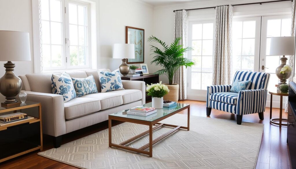
Stripes + Florals
The structured nature of stripes balances the organic quality of florals. This classic combination works in almost any style, from traditional to modern.

Geometric + Organic
The contrast between structured geometric patterns and free-flowing organic patterns creates visual interest. Try pairing a geometric rug with organic botanical prints.

Animal Print + Solid
Animal prints function almost like neutrals in design. Pair a leopard print pillow with solid-colored furniture and one additional subtle pattern for a sophisticated look.

The 60-30-10 Rule for Room Distribution
Beyond pillow arrangements, the 60-30-10 rule works for distributing patterns throughout an entire room:
- 60% dominant pattern: Usually on larger pieces like rugs, curtains, or bedding
- 30% secondary pattern: On medium-sized elements like accent chairs or multiple pillows
- 10% accent pattern: On smaller accessories like single pillows, lampshades, or artwork
This distribution ensures patterns feel balanced throughout the space rather than concentrated in one area.
Small Space Considerations

In smaller rooms, pattern mixing requires a lighter touch. Follow these guidelines when working with limited space:
- Limit your color palette to 2-3 colors plus neutrals
- Choose smaller-scale patterns that won’t visually overwhelm the space
- Incorporate more negative space within patterns (patterns with “breathing room”)
- Use patterns strategically on items that can be easily changed (pillows, throws)
- Balance patterns with plenty of solid colors and textured neutrals
Designer Tip: In small spaces, consider using pattern on just one focal wall (through wallpaper or art) rather than throughout the entire room.
Common Pattern Mixing Mistakes to Avoid
Matching Patterns Too Perfectly
Ironically, patterns that are too similar in scale and style can clash more than patterns that contrast. Avoid using multiple patterns of the exact same scale—they’ll compete visually.
Forgetting About Texture
Even the best pattern mix can fall flat without textural elements. Always incorporate different textures to add depth and dimension to your pattern story.
Distributing Patterns Unevenly
Concentrating all patterns in one area of the room creates visual imbalance. Aim to distribute patterns throughout the space for a cohesive look.

“The biggest mistake beginners make is playing it too safe. Don’t be afraid to create contrast—that’s where the magic happens in pattern mixing.”
Start Mixing Patterns With Confidence
Mixing patterns like an interior designer doesn’t require an art degree or years of experience—just an understanding of basic principles and the confidence to experiment. Remember that the most interesting rooms tell a visual story through varied patterns that share a color connection.
Start small with pillows or accessories, then gradually build your pattern-mixing skills. Before long, you’ll be creating spaces with the layered, collected look that defines professional interior design.

Need Help With Your Pattern Mixing Journey?
Still feeling unsure about mixing patterns in your home? Our design experts can help you create a personalized pattern plan that reflects your style and works with your existing furnishings.
Frequently Asked Questions About Pattern Mixing
How many patterns is too many in one room?
There’s no strict rule, but most designers recommend limiting a room to 3-5 distinct patterns for balance. The key is varying the scale and maintaining a cohesive color palette. In larger rooms, you can incorporate more patterns as long as they’re distributed evenly throughout the space.
Can I mix patterns if I prefer a minimalist aesthetic?
Absolutely! For a minimalist approach, stick to subtle patterns in a very limited color palette (perhaps just black and white or tone-on-tone patterns). Focus more on texture variation and keep the number of different patterns to just two or three.
What’s the easiest pattern to mix with other patterns?
Stripes are often considered the most versatile pattern to mix with others. They function almost like a neutral and pair well with florals, geometrics, and abstract patterns. Animal prints (particularly leopard) also work surprisingly well as neutrals in pattern mixing.